A bar graph refers to a graph or chart that represents categorical data using rectangular bars. Moreover, the height or length of these bars is proportional to the values they represent. Although having a graphically appealing chart is good, how to label a bar graph is paramount because that is what communicates the information to the viewers.
In this article, you will learn how to properly label a bar graph, as well as how to execute this task in MATLAB, R, and Python.

How to Properly Label a Bar Graph
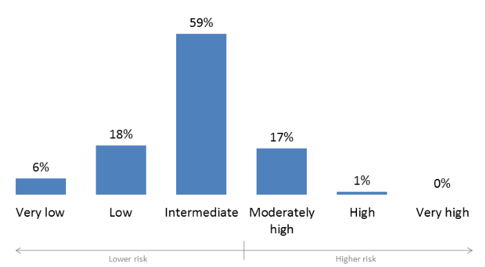
Properly labelling a bar graph is what makes reading it worthwhile. Generally, there are two ways of labelling a bar graph which are using axis labels or data point labels. When the audience needs to know the individual values in the chart, then data point labels are preferable. Mostly, the position of these labels is on the inside end or just outside the column/bar. For example, below is a risk assessment bar chart using data point labels.
Alternatively, if the aim is the ranking of values, rather than knowing the specific values, axis labels are sufficient. For instance, the ranking of transactions for various services can use axis labels as the graph below indicates.
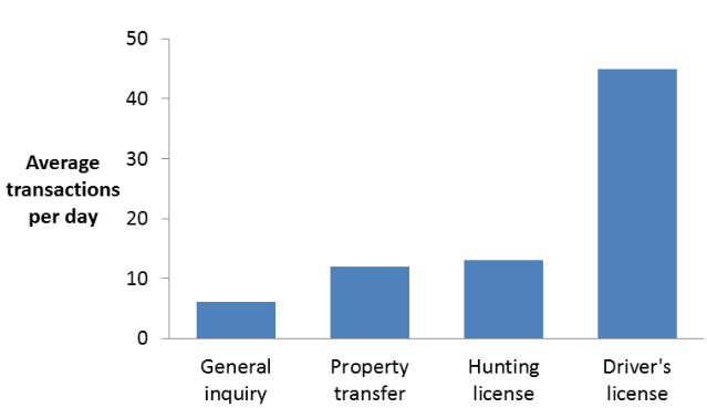
Using Axis Labels
Another factor to consider when using axis labels is the location of the dependent and independent variables. The independent variable, which is one that affects the other, should be put on the x-axis of the graph. The dependent variable is always on the y-axis. Also, it is important for these variables to have a clear indication of their units. Some common formats for indicating units on the axis are as follows:
- Parameter (Unit): Temperature (K).
- Parameter, Unit: Temperature, K.
- Parameter/Unit: Temperature/K.
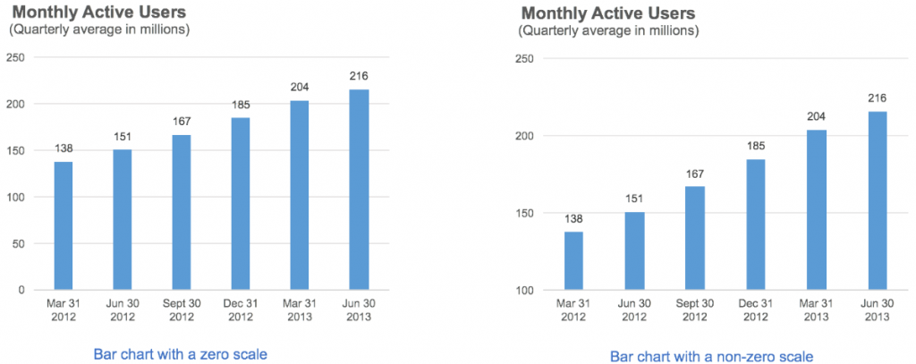
Furthermore, devising an appropriate scale for each axis is key to properly represent its values. Generally, the scale should be such that each tick mark has a value that ends with “0”, “5”, or an even number. Also, the axes do not need to start at zero. For example, in the following graphs showing monthly active users of a platform, the y-axis values range from 138 to 216. Both graphs indicate the same data, but the one on the left uses a zero scale, while that on the right uses a non-zero scale starting at 100. Clearly, the non-zero scale accentuates the difference between each bar more than its zero scale counterpart. Thus it makes it the preferable option for data visualization purposes.
How to Label a Bar Graph in MATLAB
MATLAB, an abbreviation for “MATrix LABoratory”, is a numeric computing environment from developers MathWorks. Moreover, it is an ideal platform for plotting data such as bar graphs. It possesses numerous graphical representation features and interfaces with other platforms including Java, Python, and .NET.
Creating a Bar Chart
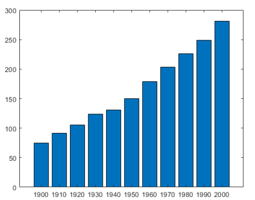
Basically, creating a bar plot in MATLAB entails using a “bar” function or command with the variables within the bracket. For example, the count of a variable from the year 1900 till 2000, for every 10 years can be plotted using the following script:
x = 1900:10:2000;
y = [75 91 105 123.5 131 150 179 203 226 249 281.5];
bar(x,y)
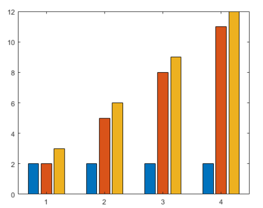
Sometimes, it is necessary to represent certain data with a group of bars rather than the simple chart above. Such an instance is if different categories of samples are taken over a period of time. So, for the proper display of such data, a grouped bar graph serves well.
y = [2 2 3; 2 5 6; 2 8 9; 2 11 12];
bar(y)
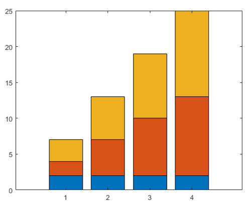
Instead of using group bar charts, stacked bar graphs serve well for samples/variables with categories. Moreover, stacked charts have the advantage of conserving space if the amount of data increases.
y = [2 2 3; 2 5 6; 2 8 9; 2 11 12];
bar(y,’stacked’)
Labeling Simple Bar Graphs in MATLAB
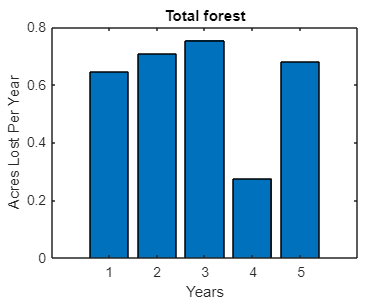
Generally, the basic labels for a bar graph are the x-axis, y-axis, and title labels. For instance, the subsequent code and plot represent acres of forest lost to fire over 5 years.
years = rand(5,1);
bar(years)
title(‘Total Forest Lost’)
xlabel(‘Years’)
ylabel(‘Acres Per Year’)
Alternatively, a legend distinguishes between variables rather than labels as the code and plot below show:
y =[44,55,54];
hold on
for i=1:numel(y)
bar(i, y(i))
end
legend({‘first’, ‘second’, ‘third’})
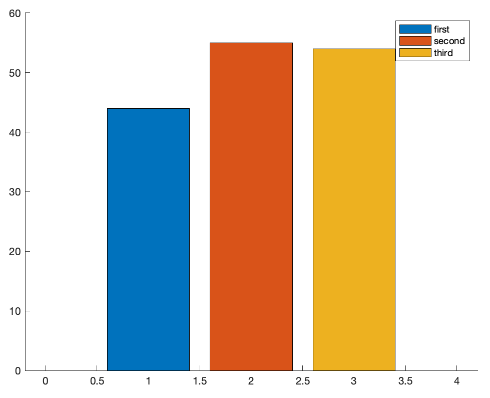
Finally, adjusting the axis labels is another thing that improves the appearance of a bar graph. Because sometimes, the length of an axis label text may be too long and interfere with neighboring text. So, it is necessary to rotate the label. For example, the x-axis label is rotated by 45° to fit within the available space.
xtickangle(45)

Labeling Grouped Bar Graphs
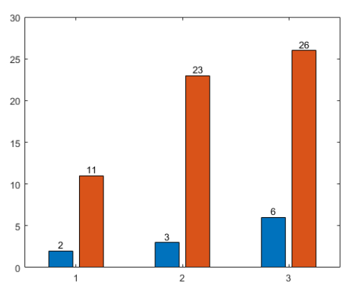
Because of the presence of multiple bars or the resolution of the y-axis scale, it may be necessary to specify the label on each bar of a grouped bar graph. Achieving this requires much more coding than in previous sections, with the code and result as follows:
x = [1 2 3];
vals = [2 3 6; 11 23 26];
b = bar(x,vals);
xtips1 = b(1).XEndPoints;
ytips1 = b(1).YEndPoints;
labels1 = string(b(1).YData);
text(xtips1,ytips1,labels1,’HorizontalAlignment’,’center’,…
‘VerticalAlignment’,’bottom’)
xtips2 = b(2).XEndPoints;
ytips2 = b(2).YEndPoints;
labels2 = string(b(2).YData);
text(xtips2,ytips2,labels2,’HorizontalAlignment’,’center’,…
‘VerticalAlignment’,’bottom’)
Labeling Stacked Charts
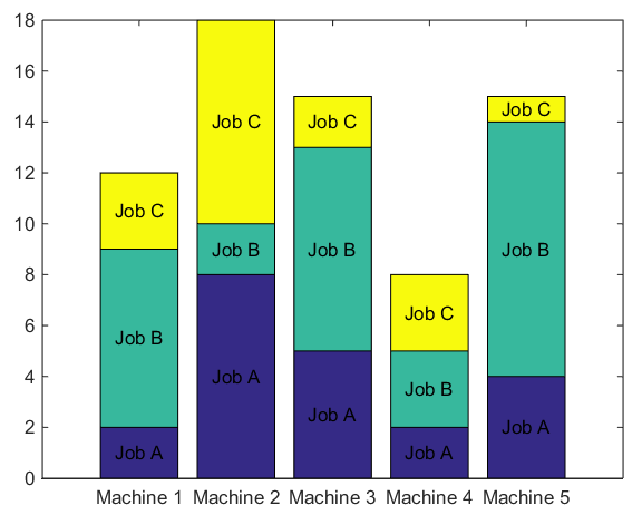
When labeling a stacked chart, it is important to identify each stack. A legend often serves this purpose, however, fixing the label within each stack is a clearer way of achieving this.
D = randi(10, 5, 3);
figure(1)
hBar = bar(D, ‘stacked’);
xt = get(gca, ‘XTick’);
set(gca, ‘XTick’, xt, ‘XTickLabel’, {‘Machine 1’ ‘Machine 2’ ‘Machine 3’ ‘Machine 4’ ‘Machine 5’})
yd = get(hBar, ‘YData’);
yjob = {‘Job A’ ‘Job B’ ‘Job C’};
barbase = cumsum([zeros(size(D,1),1) D(:,1:end-1)],2);
joblblpos = D/2 + barbase;
for k1 = 1:size(D,1)
text(xt(k1)*ones(1,size(D,2)), joblblpos(k1,:), yjob, ‘HorizontalAlignment’,’center’)
end
How to Label a Bar Graph in R
R is a programming language with wide use in the field of statistical computing and graphics. As a result, it is common to use it in the plotting of bar graphs. Generally, its syntax for creating a bar chart is relatively compact, with the general format as follows:
barplot(H,xlab,ylab,main, names.arg,col)
The description of each parameter within the “barplot” function is:
- H: This parameter represents the vector or matrix that contains the numeric values in the bar graph.
- xlab: This parameter is the label of the x-axis.
- ylab: While, this represents the label of the y-axis.
- main: Refers to the title of the bar graph.
- names.arg: This is a vector containing names that will appear under each bar in the chart.
- col: The col parameter serves to give colors to the bars.
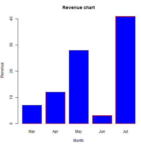
This is not an exhaustive list of all the parameters, as there are several others that come in handy. In any case, whatever is to show on the plot should be within the function. So, to create a simple chart with axes labels and titles, this script can be used:
# Create the data for the chart
H <- c(7,12,28,3,41)
M <- c(“Mar”,”Apr”,”May”,”Jun”,”Jul”)
# Plot the bar chart
barplot(H,names.arg=M,xlab=”Month”,ylab=”Revenue”,col=”blue”,
main=”Revenue chart”,border=”red”)
Grouped and Stacked Charts in R
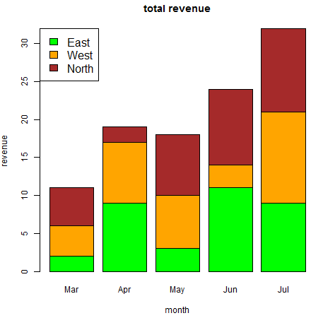
When plotting a grouped or stacked chart, the input values should be in form of a matrix. For example, below is a plot of the monthly revenue from three regions (East, West, and North) from March to July.
# Create the input vectors.
colors = c(“green”,”orange”,”brown”)
months <- c(“Mar”,”Apr”,”May”,”Jun”,”Jul”)
regions <- c(“East”,”West”,”North”)
# Create the matrix of the values.
Values <- matrix(c(2,9,3,11,9,4,8,7,3,12,5,2,8,10,11), nrow = 3, ncol = 5, byrow = TRUE)
# Create the bar chart
barplot(Values, main = “total revenue”, names.arg = months, xlab = “month”, ylab = “revenue”, col = colors)
# Add the legend to the chart
legend(“topleft”, regions, cex = 1.3, fill = colors)
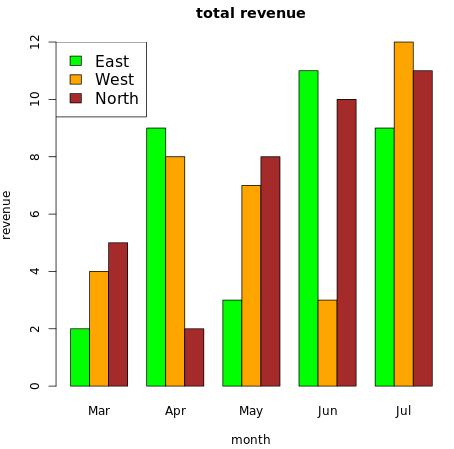
On the other hand, the same data as above can produce a group plot by introducing the “beside” parameter into the function and setting it to “TRUE”.
# Create the input vectors.
colors = c(“green”,”orange”,”brown”)
months <- c(“Mar”,”Apr”,”May”,”Jun”,”Jul”)
regions <- c(“East”,”West”,”North”)
# Create the matrix of the values.
Values <- matrix(c(2,9,3,11,9,4,8,7,3,12,5,2,8,10,11), nrow = 3, ncol = 5, byrow = TRUE)
# Create the bar chart
barplot(Values, main = “total revenue”, names.arg = months, xlab = “month”, ylab = “revenue”, col = colors, beside = TRUE)
# Add the legend to the chart
legend(“topleft”, regions, cex = 1.3, fill = colors)
How to Label a Bar Graph in Python
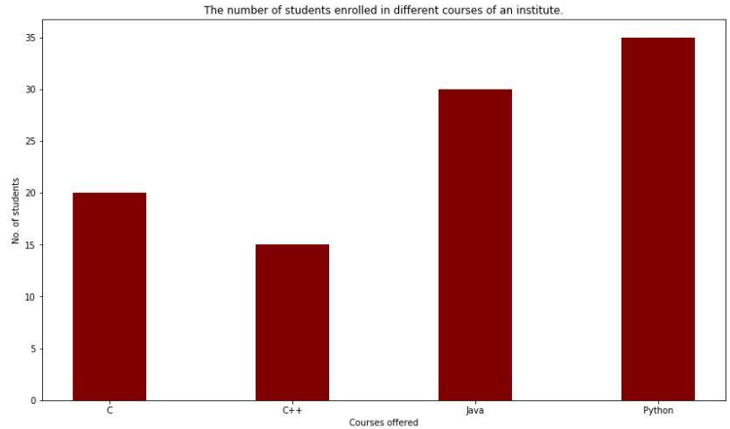
Python is another programming language with a high level of use because of its diverse capabilities. Moreover, its ability to interface with several platforms and databases makes it a popular tool for data analysis and visualization. But to achieve this interface, Python’s matplotlib API creates bar graphs in Python. For example, below is a script and resultant plot of students offering various programming languages in an institute.
import numpy as np
import matplotlib.pyplot as plt
# creating the dataset
data = {‘C’:20, ‘C++’:15, ‘Java’:30,
‘Python’:35}
courses = list(data.keys())
values = list(data.values())
fig = plt.figure(figsize = (10, 5))
# creating the bar plot
plt.bar(courses, values, color =’maroon’,
width = 0.4)
plt.xlabel(“Courses offered”)
plt.ylabel(“No. of students enrolled”)
plt.title(“Students enrolled in different courses”)
plt.show()
Multiple Bar Plots
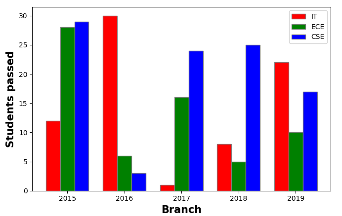
In Python, it is common to refer to grouped or stacked bar graphs as multiple bar plots. Because the specification of such plots involves calling the “bar” function multiple times with each set of data as follows:
import numpy as np
import matplotlib.pyplot as plt
# set width of bar
barWidth = 0.25
fig = plt.subplots(figsize =(12, 8))
# set height of bar
IT = [12, 30, 1, 8, 22]
ECE = [28, 6, 16, 5, 10]
CSE = [29, 3, 24, 25, 17]
# Set position of bar on X axis
br1 = np.arange(len(IT))
br2 = [x + barWidth for x in br1]
br3 = [x + barWidth for x in br2]
# Make the plot
plt.bar(br1, IT, color =’r’, width = barWidth,
edgecolor =’grey’, label =’IT’)
plt.bar(br2, ECE, color =’g’, width = barWidth,
edgecolor =’grey’, label =’ECE’)
plt.bar(br3, CSE, color =’b’, width = barWidth,
edgecolor =’grey’, label =’CSE’)
# Adding Xticks
plt.xlabel(‘Branch’, fontweight =’bold’, fontsize = 15)
plt.ylabel(‘Students passed’, fontweight =’bold’, fontsize = 15)
plt.xticks([r + barWidth for r in range(len(IT))],
[‘2015’, ‘2016’, ‘2017’, ‘2018’, ‘2019’])
plt.legend()
plt.show()
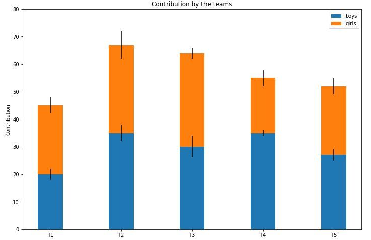
On the other hand, creating stacked charts involves introducing a new parameter ‘bottom’ into the plot function and assigning it the set of data that will be at the base of the stack.
import numpy as np
import matplotlib.pyplot as plt
N = 5
boys = (20, 35, 30, 35, 27)
girls = (25, 32, 34, 20, 25)
boyStd = (2, 3, 4, 1, 2)
girlStd = (3, 5, 2, 3, 3)
ind = np.arange(N)
width = 0.35
fig = plt.subplots(figsize =(10, 7))
p1 = plt.bar(ind, boys, width, yerr = boyStd)
p2 = plt.bar(ind, girls, width,
bottom = boys, yerr = girlStd)
plt.ylabel(‘Contribution’)
plt.title(‘Contribution by the teams’)
plt.xticks(ind, (‘T1’, ‘T2’, ‘T3’, ‘T4’, ‘T5’))
plt.yticks(np.arange(0, 81, 10))
plt.legend((p1[0], p2[0]), (‘boys’, ‘girls’))
plt.show()
